01Case study · Brand and website · 2026
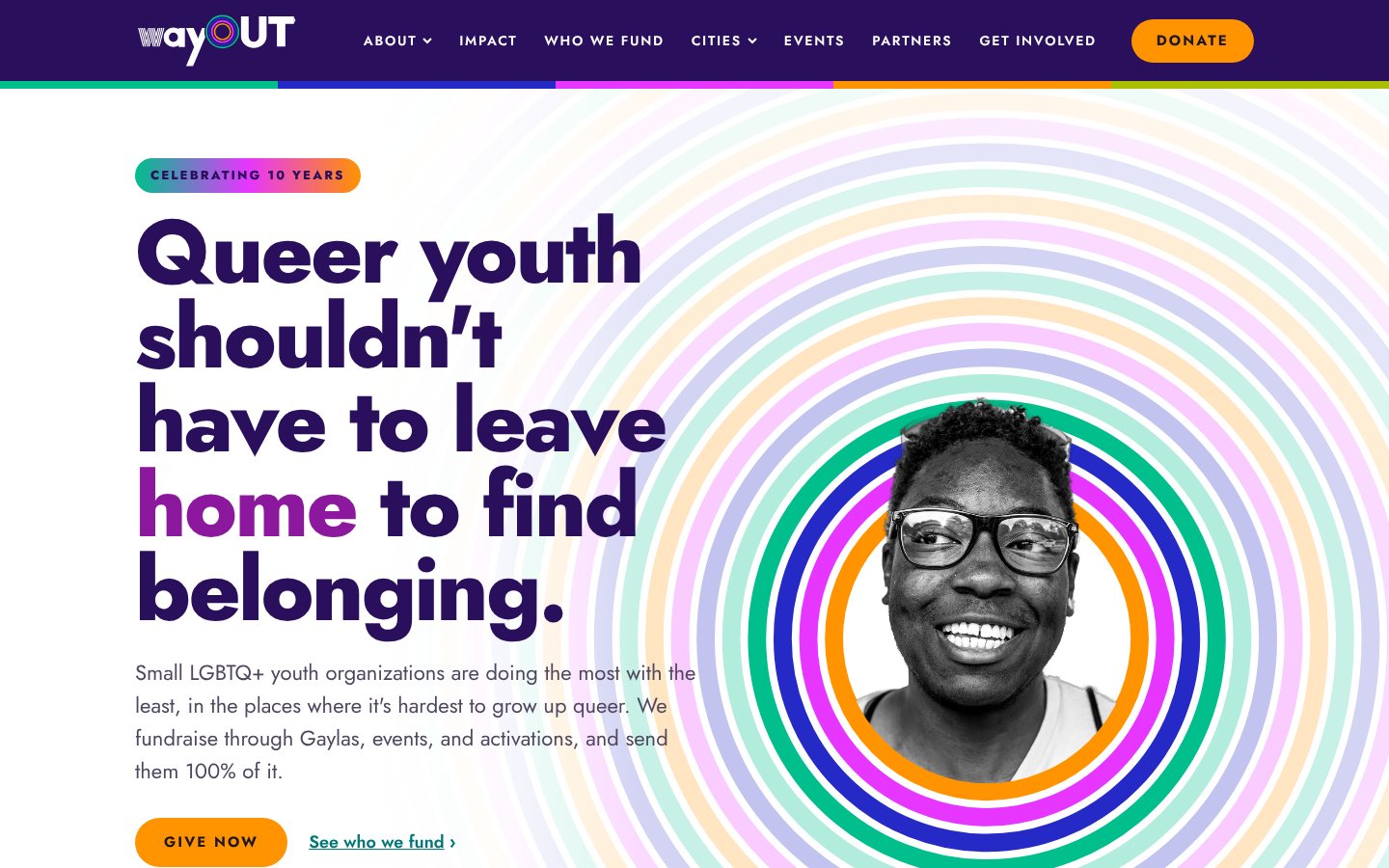
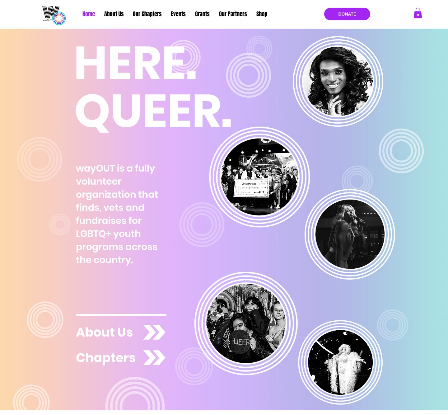 BeforeAfter
The wayOUT LGBTQ Foundation has raised more than $2.2 million for small, local LGBTQ+ youth organizations since 2016. For its tenth year, Victor/Victoria refined the brand and rebuilt the website so both feel like a night at a wayOUT Gayla.
Part oneThe brand
A brand with ten years behind it has a history worth keeping. This was the moment to sharpen it, not start over.
02The mission
The old mission sounded like wayOUT worked with young people directly. It doesn't. It funds the small, local organizations that do. The rewrite says so, explains how, and gives the foundation a point of view in its own name.
wayOUT empowers LGBTQ+ youth to feel safe being who they really are.
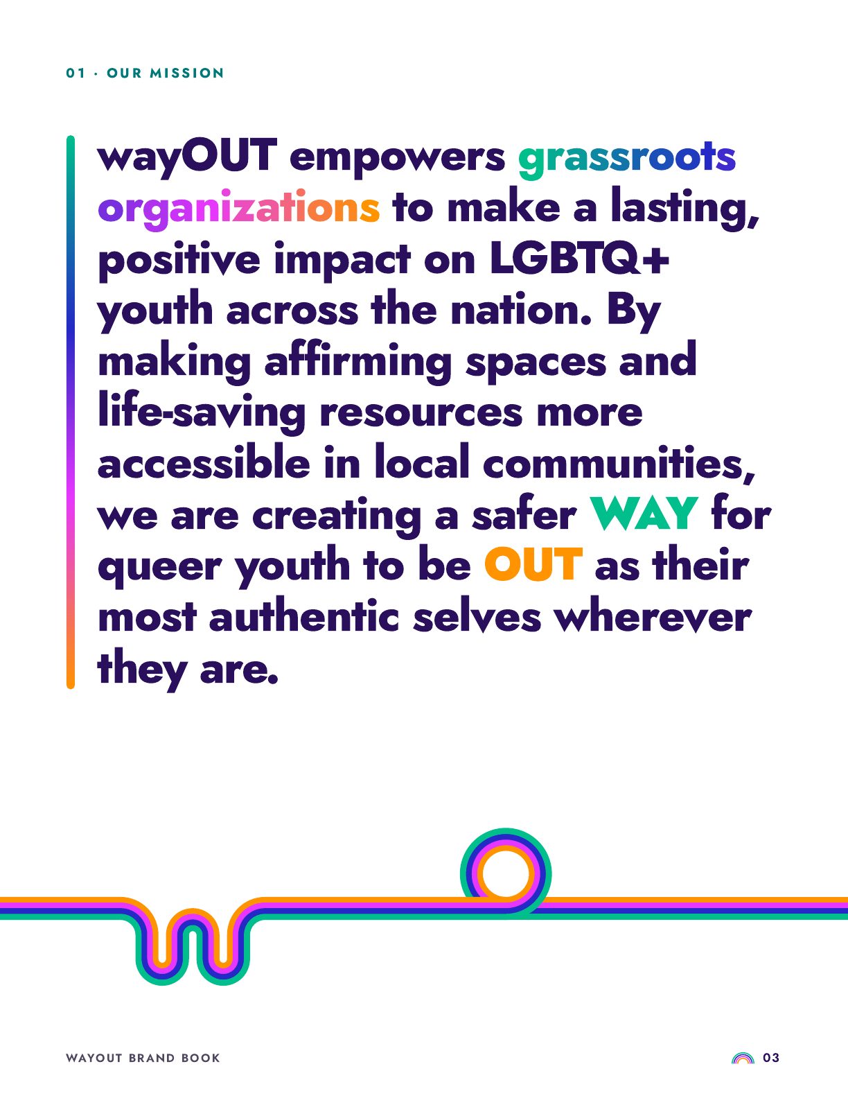
wayOUT empowers grassroots organizations to make a lasting, positive impact on LGBTQ+ youth across the nation. By making affirming spaces and life-saving resources more accessible in local communities, we are creating a safer WAY for queer youth to be OUT as their most authentic selves wherever they are.
wayOUT backs grassroots organizations, and they reach the young people. The mission now starts there.
Affirming spaces and life-saving resources, closer to home. A donor knows exactly what they're funding.
A safer WAY to be OUT. The name carries the promise, so the mission sounds like no one else's.
03Evolution
Every wayOUT logo has handed something to the next. The first brought an arrow: a way out, pointing forward. The second brought the gradient: color flowing shade to shade. A brand with ten years behind it has hit its first heritage milestone, and now it's time to honor it.
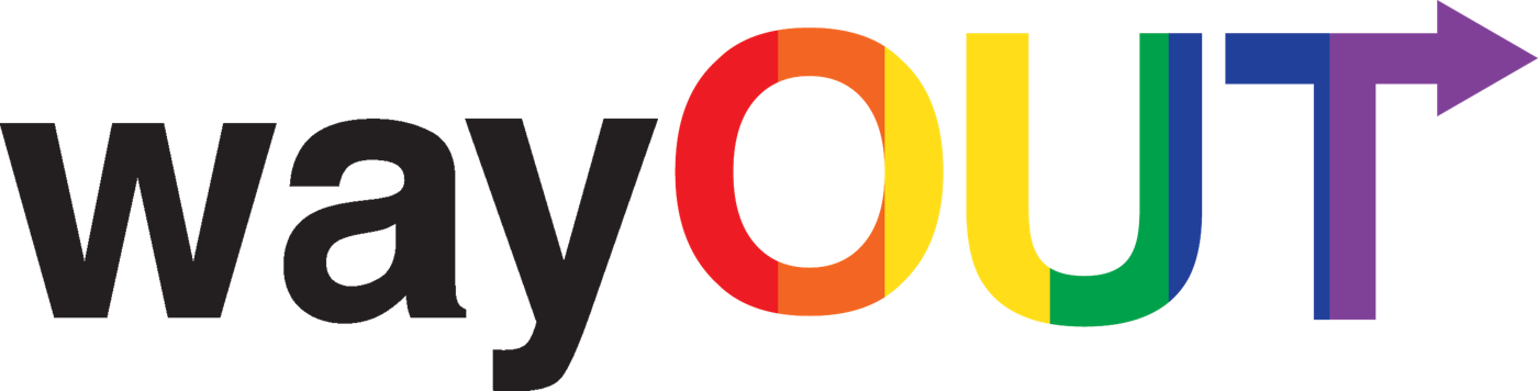
A rainbow OUT and a T that points the way.
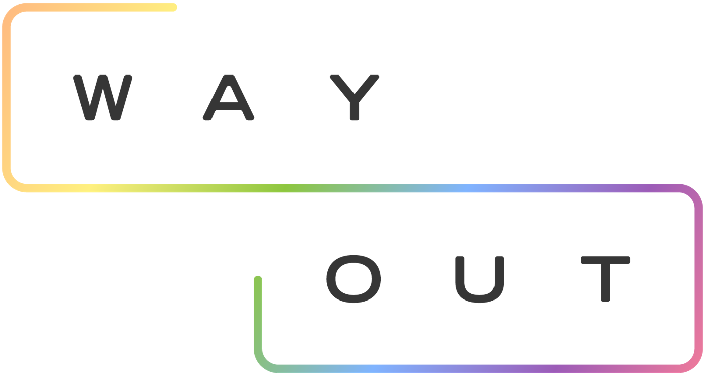
One line of color that melts from shade to shade.
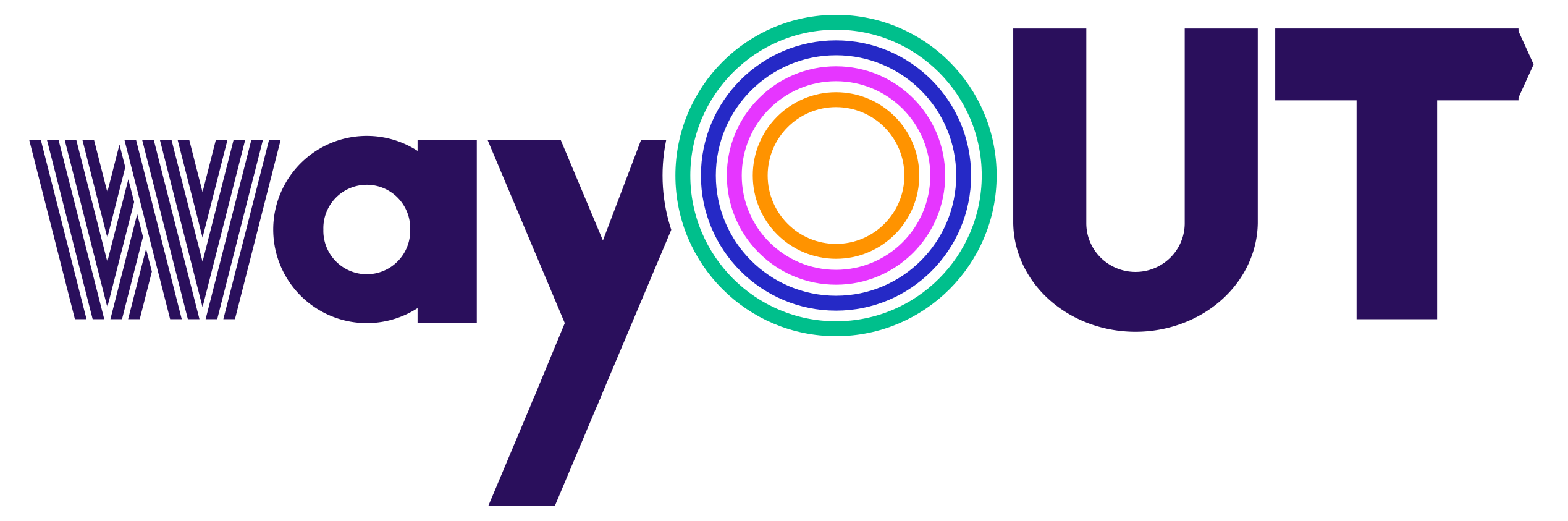
The arrow lives in the T. The color lives in the O.
04The new logo
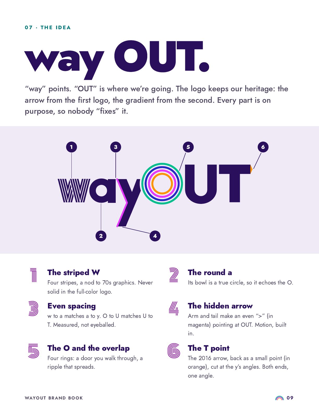
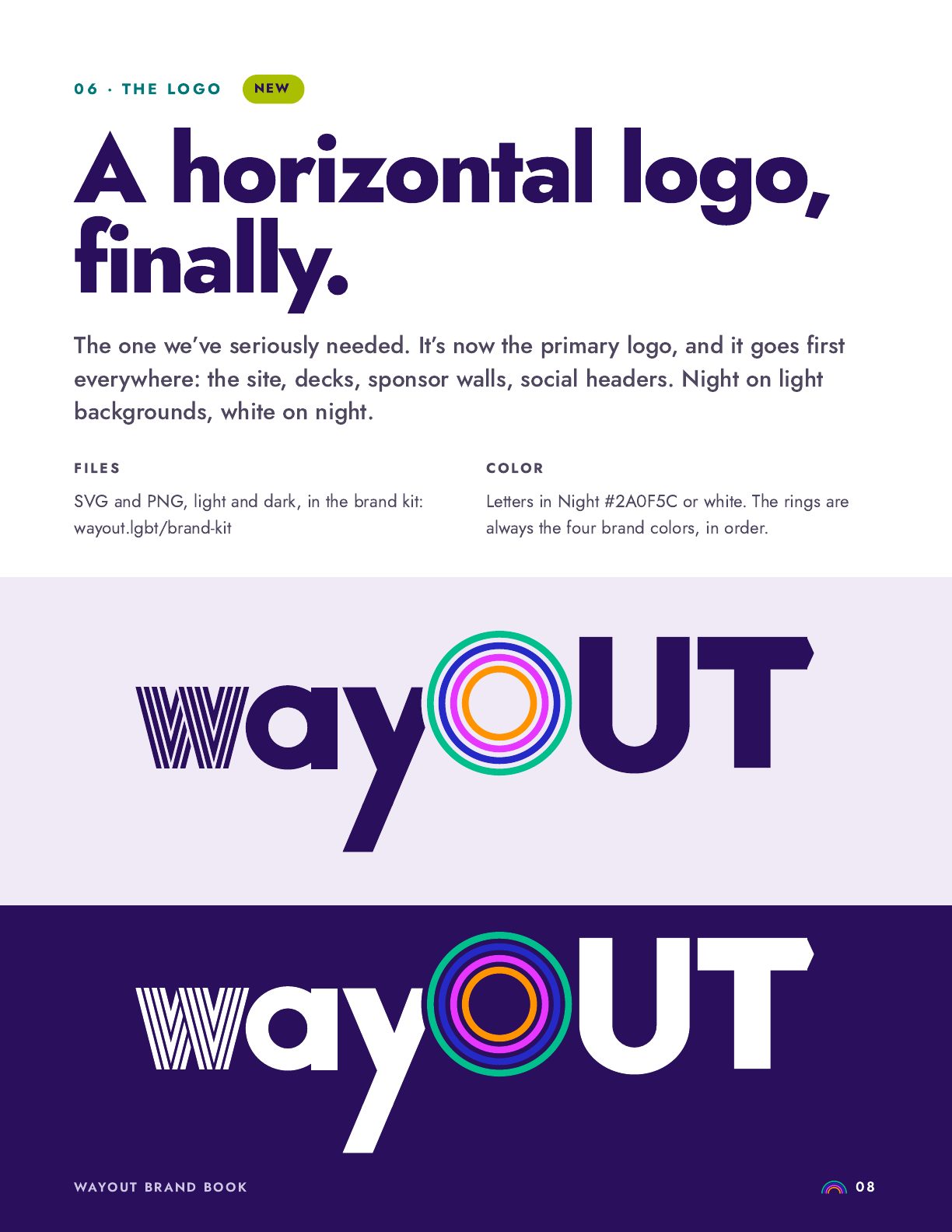
The arrow is back, quieter this time. Watch it: the arrow hidden in the y travels to the tip of the T and lands at the same angle. The word starts and ends pointing forward.
The 2016 arrow comes back in the T as a single cut point. Subtle enough to discover, there every time.
The y's arm and tail form an even ">" pointing straight at OUT. Motion, built into the word.
The T's point is cut at the y's exact angles, so the two ends of the word mirror each other. Symmetry holds the motion together.
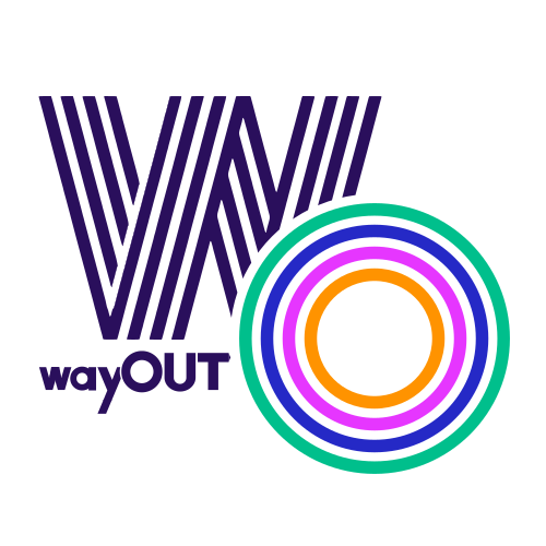
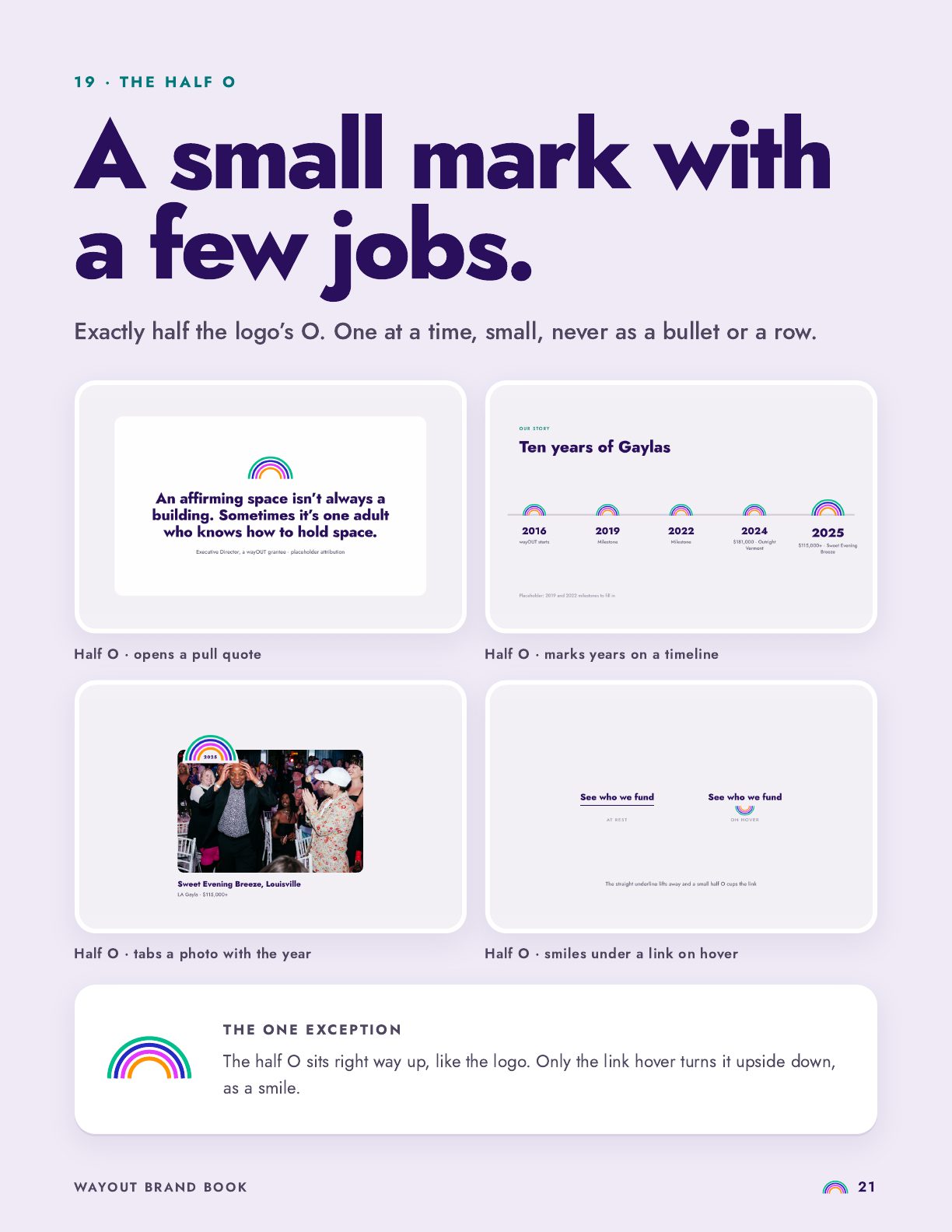
The rainbow, kept and pared to four rings: a door you walk through, a ripple that spreads.

05The rainbow
Most LGBTQ+ organizations fly a rainbow, and for good reason: it ties them to the community and to Pride. wayOUT keeps that connection, and the new palette makes it feel fresh. The cue came from Verner Panton's Curve: bands that touch, bend and flow, on a deep purple ground.
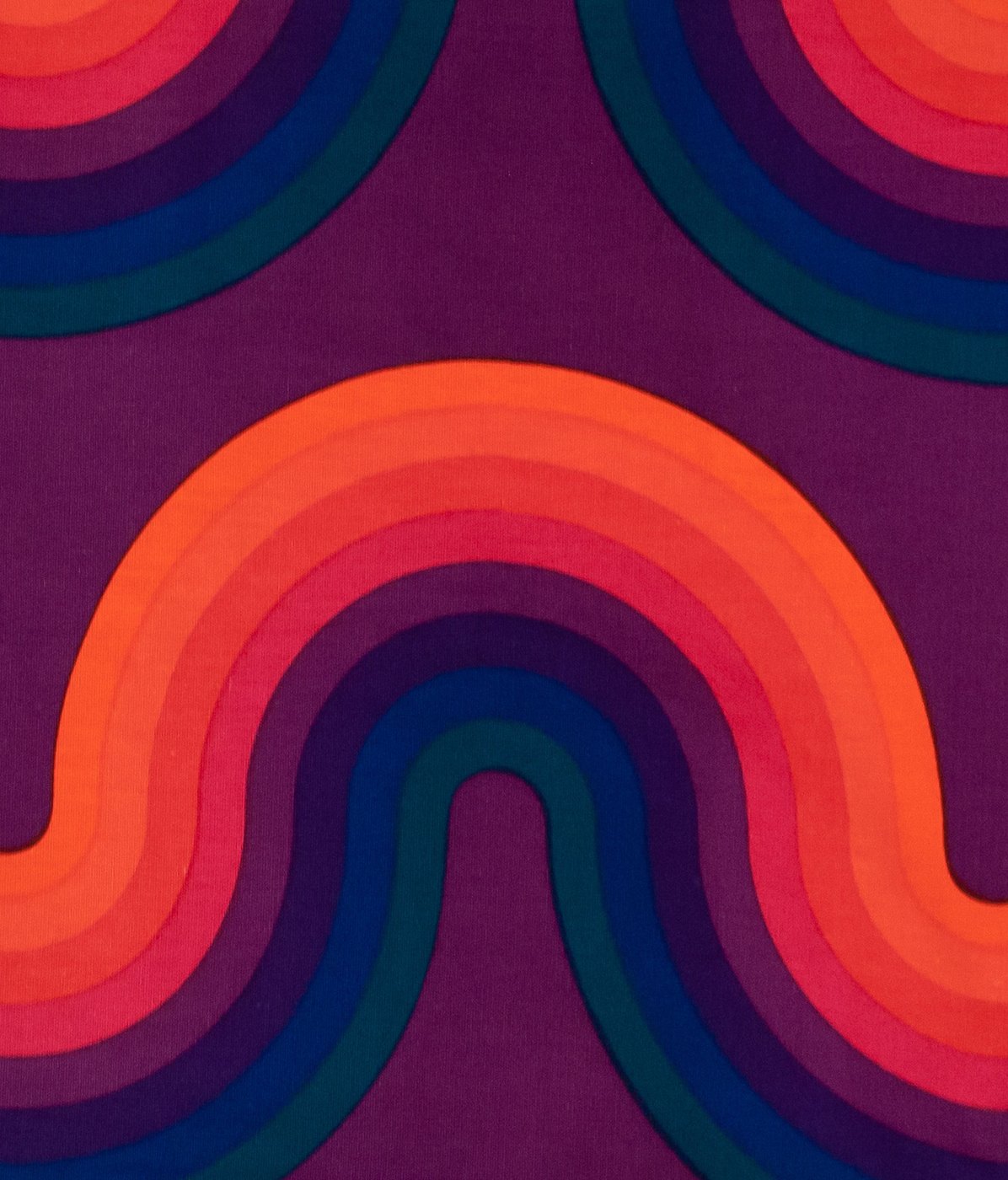
Verner Panton, Curve, 1969, for Mira-X. Photo: Caviar20.
wayOUT's band order comes straight from his: orange, then his purple ground turned up to magenta, then blue, then teal turned to jade. Same family, same order, built to glow on a phone.

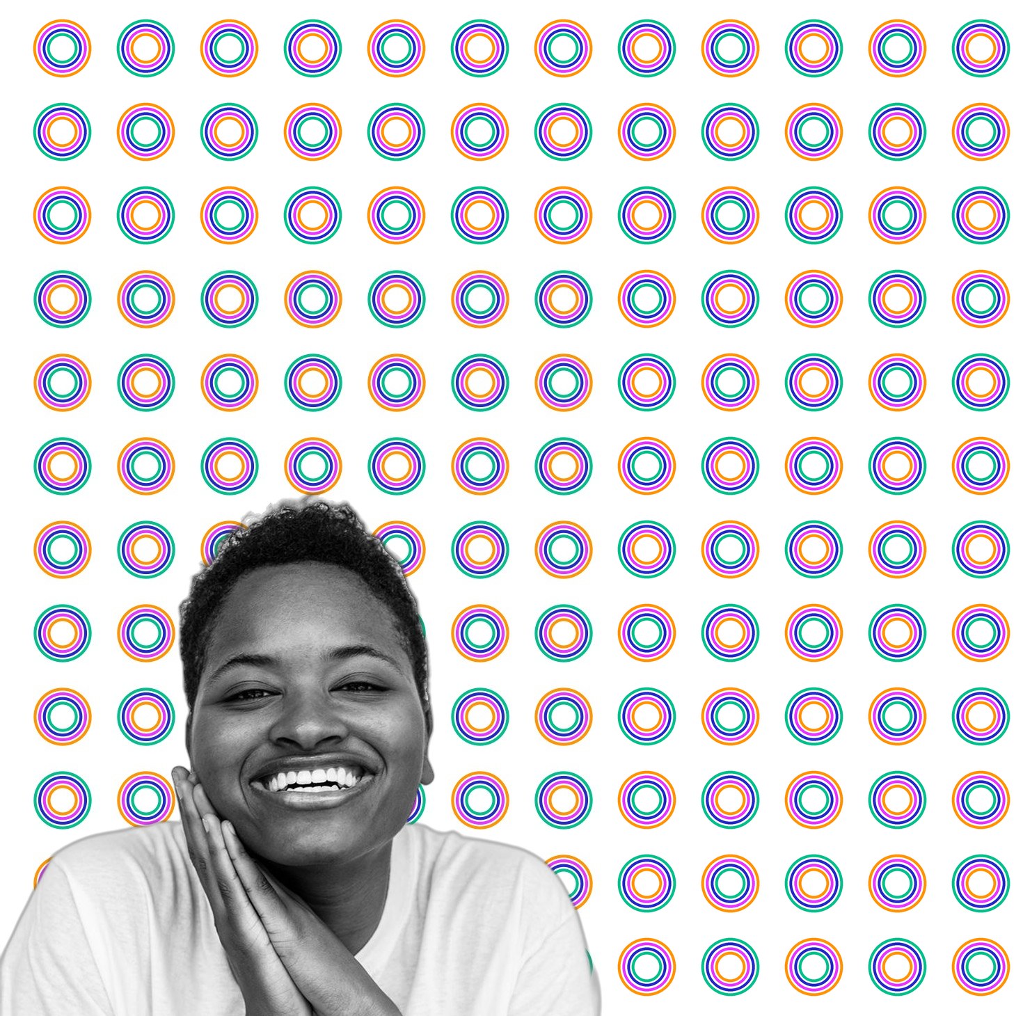
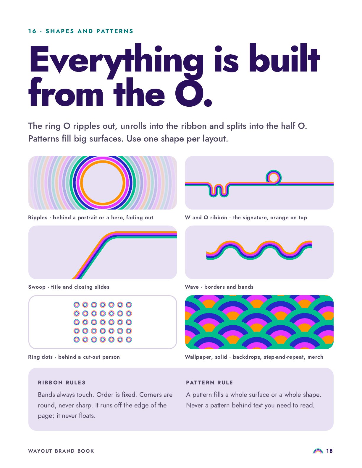
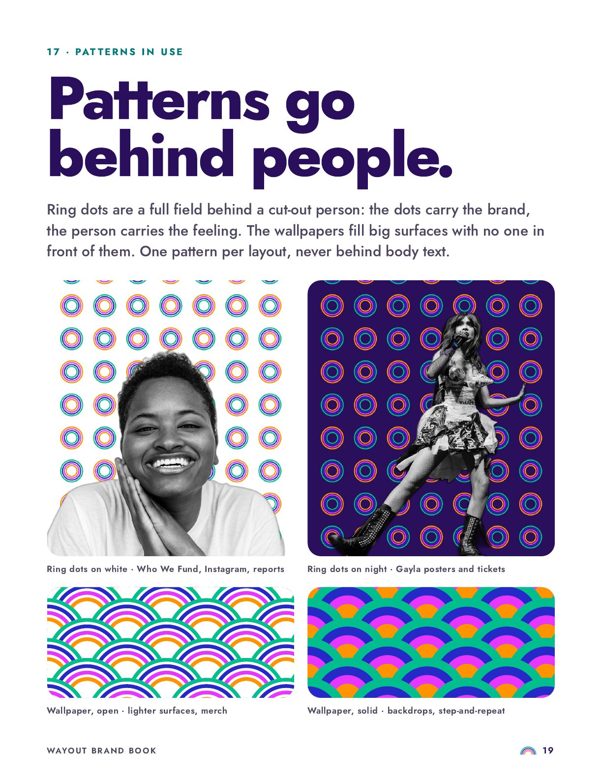
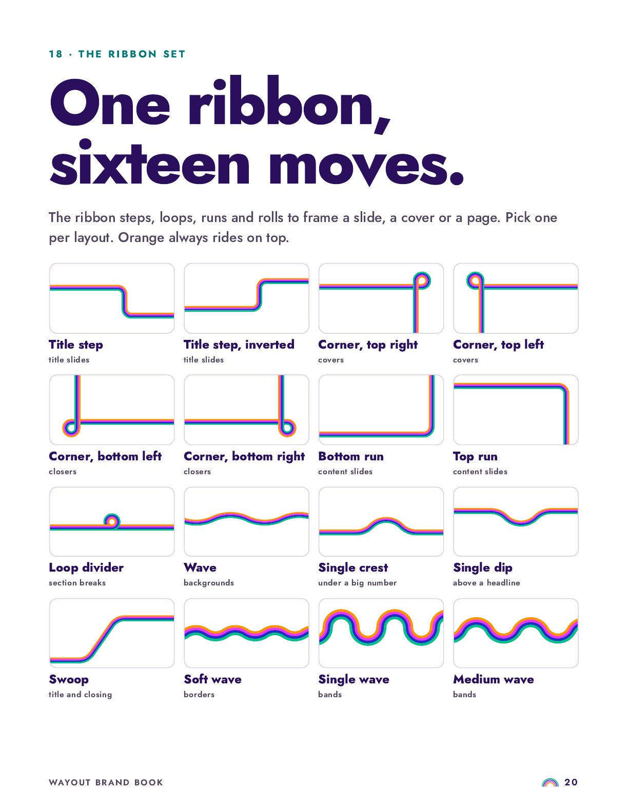
The rings don't stay in the logo. They ripple out behind portraits, unroll into a ribbon, repeat into wallpaper and scatter as dots, so a page reads as wayOUT before you see the name.


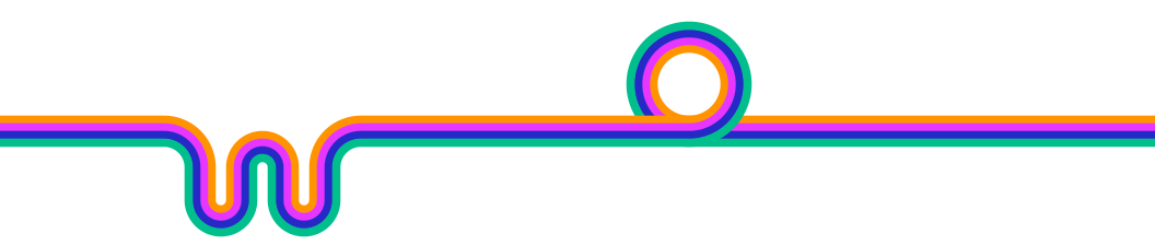
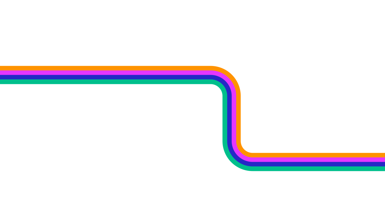

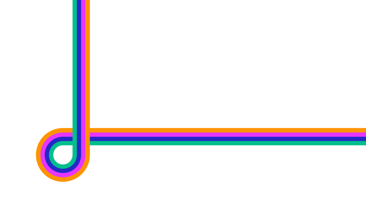

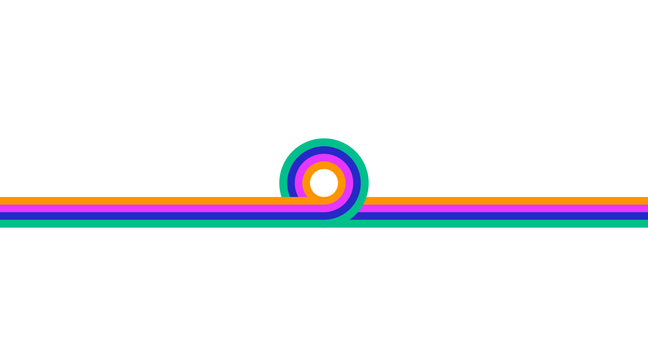
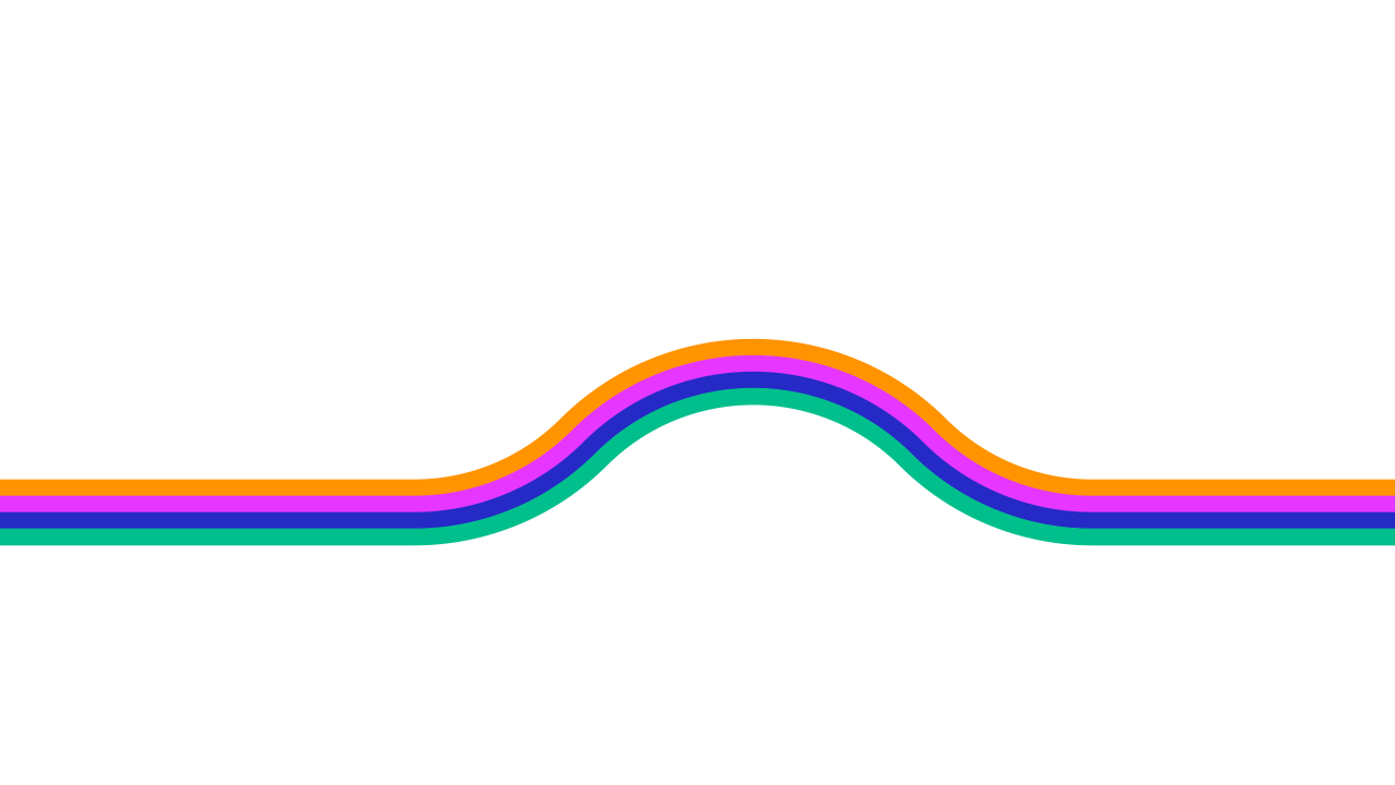
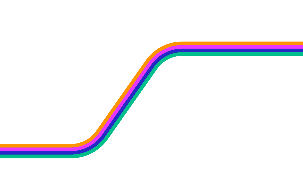

Eight of the ribbon's sixteen moves: one ribbon that bends, folds and loops to fit any layout.
06Color
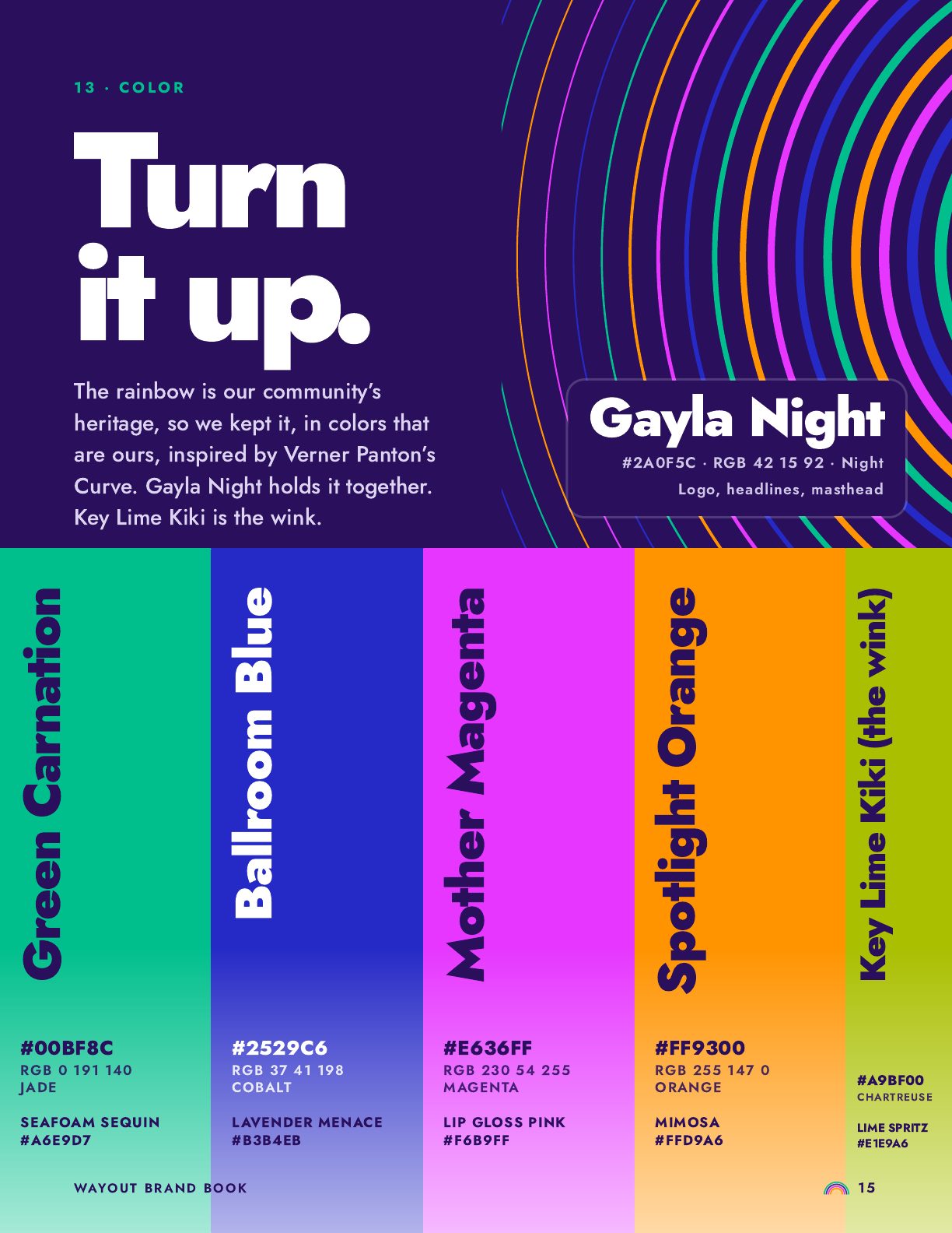
Over the years the colors had drifted: near-matches in every file, none of them built for screens. Victor/Victoria rebuilt one palette, tuned for screens and contrast, and gave every color a name. Tap any color to copy it.
Eight colors in circulation, with two oranges, two blues, two greens and a violet that matched nothing.
07The brand book
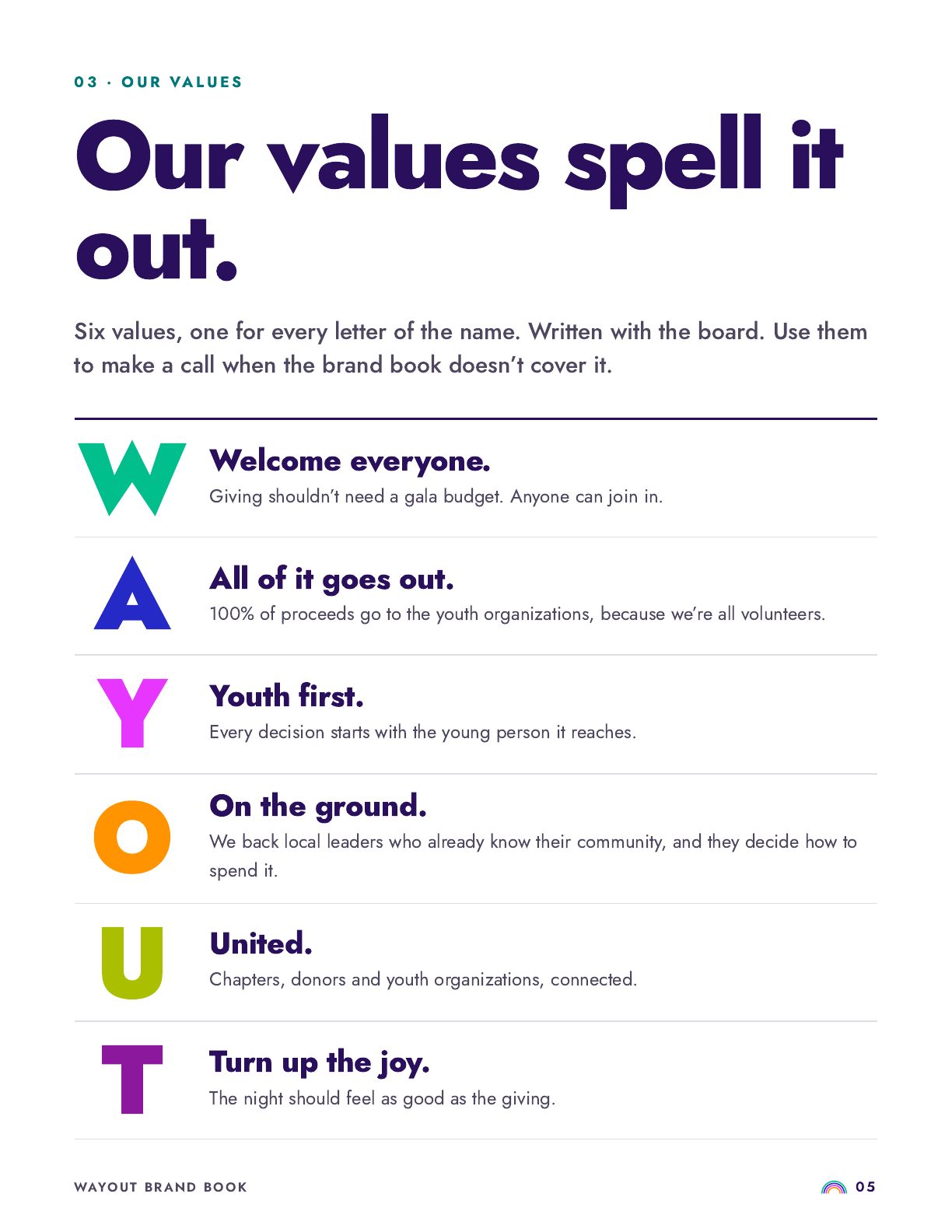
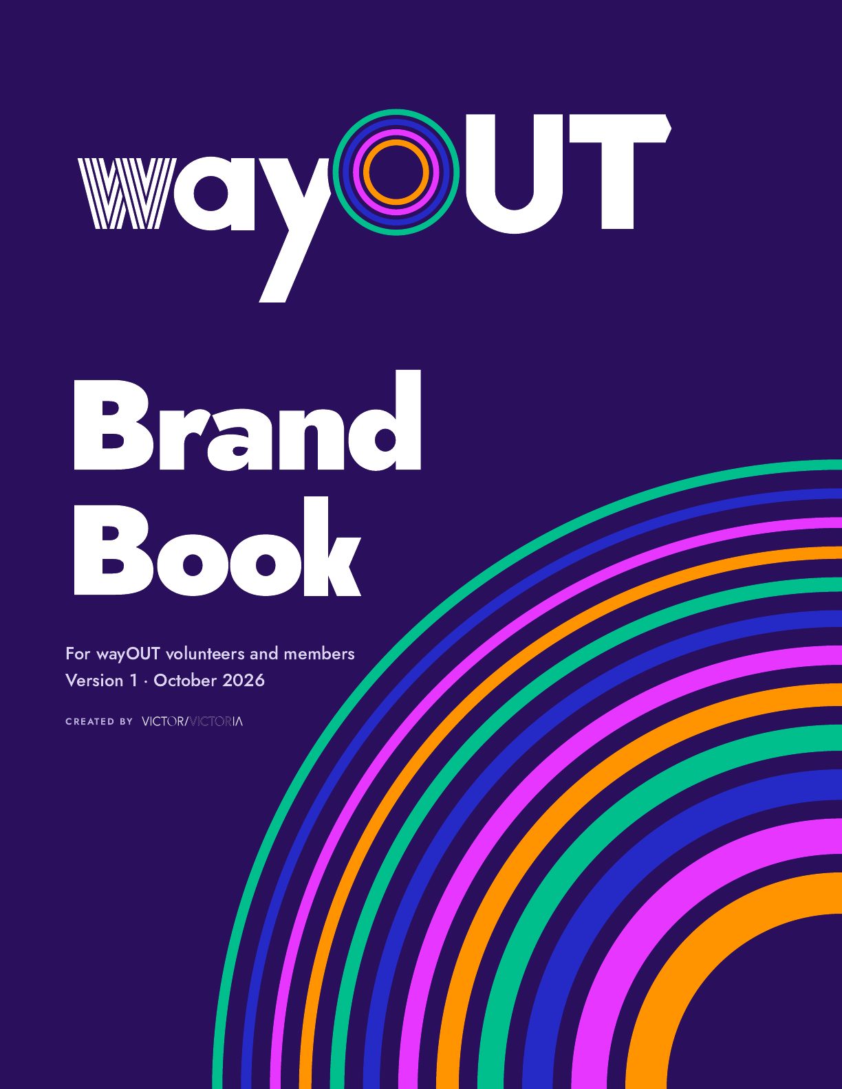
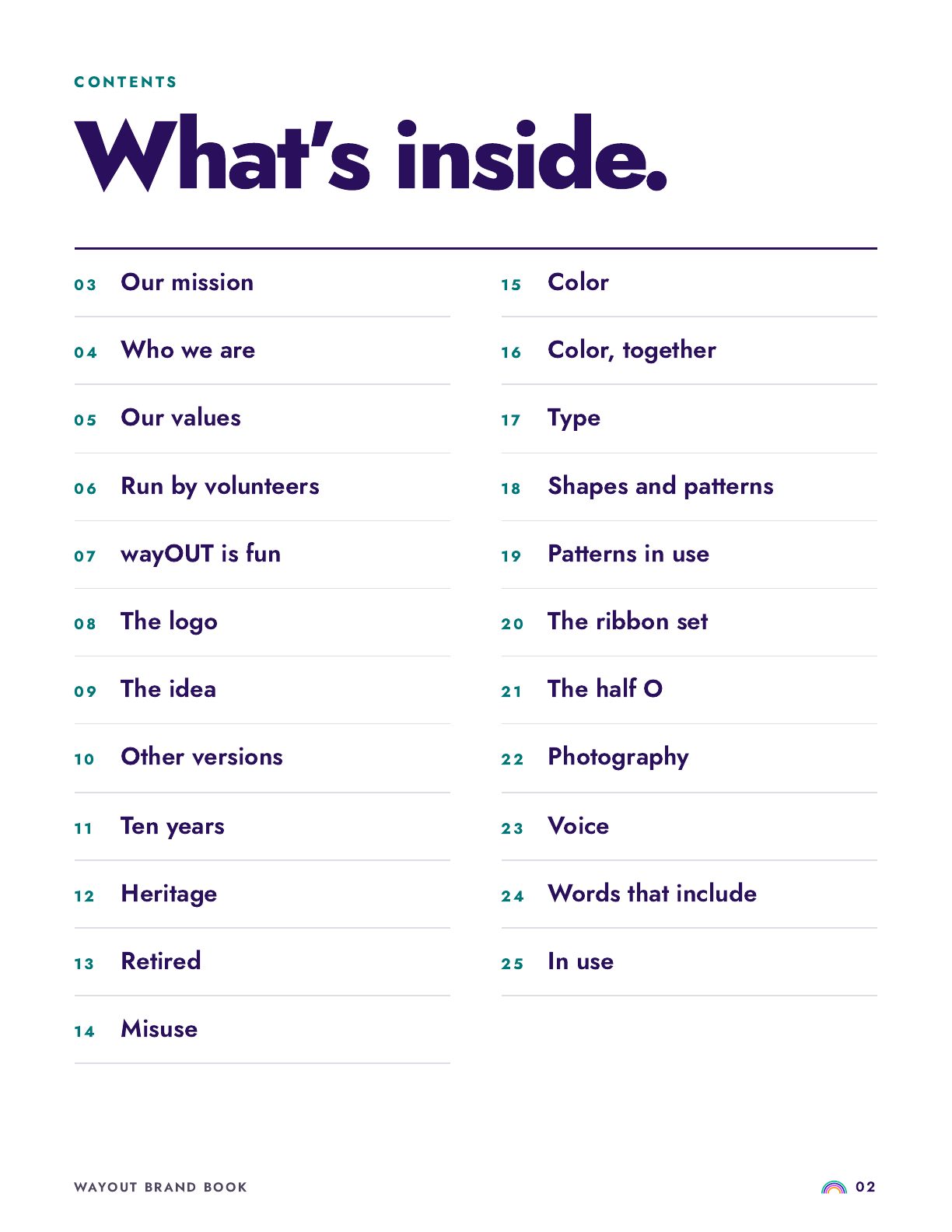
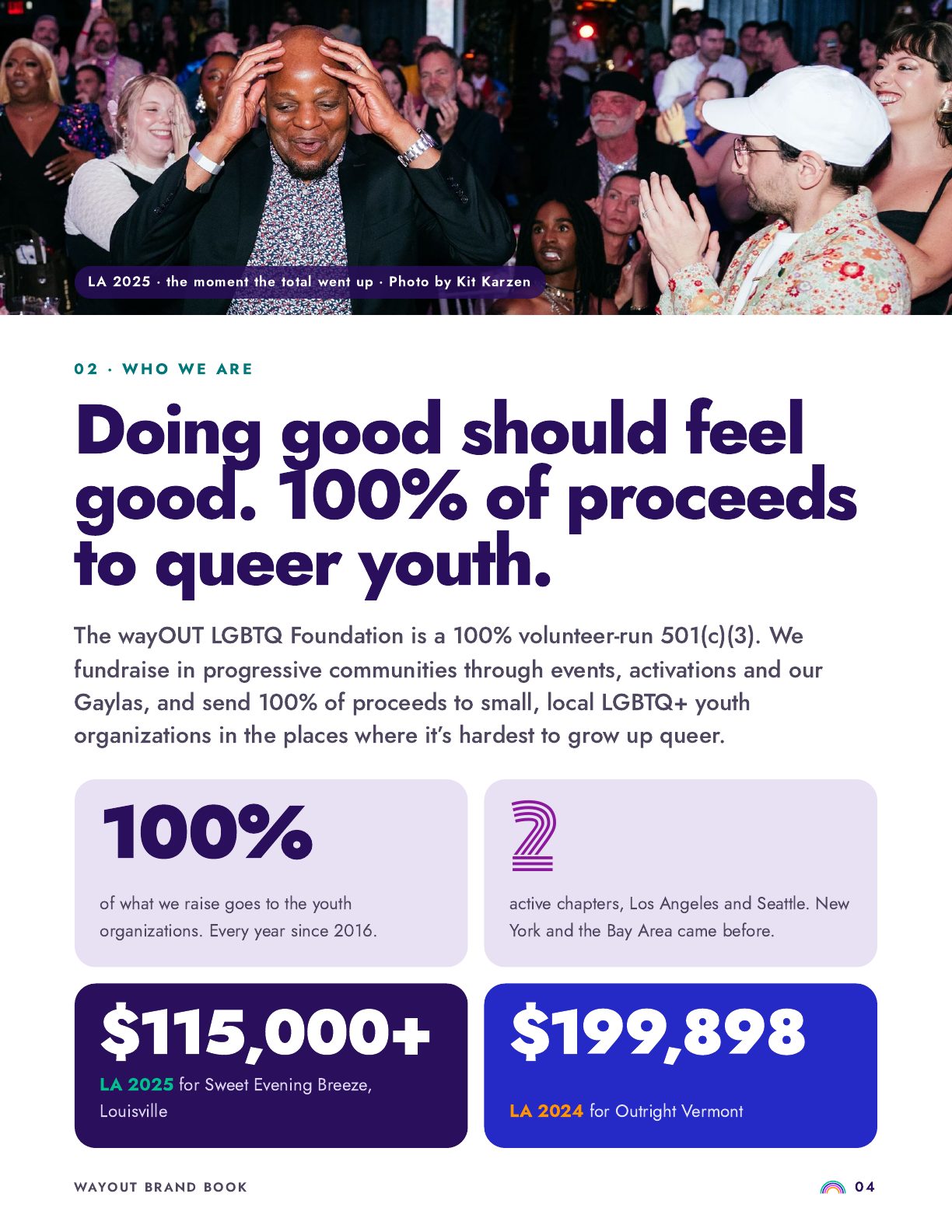
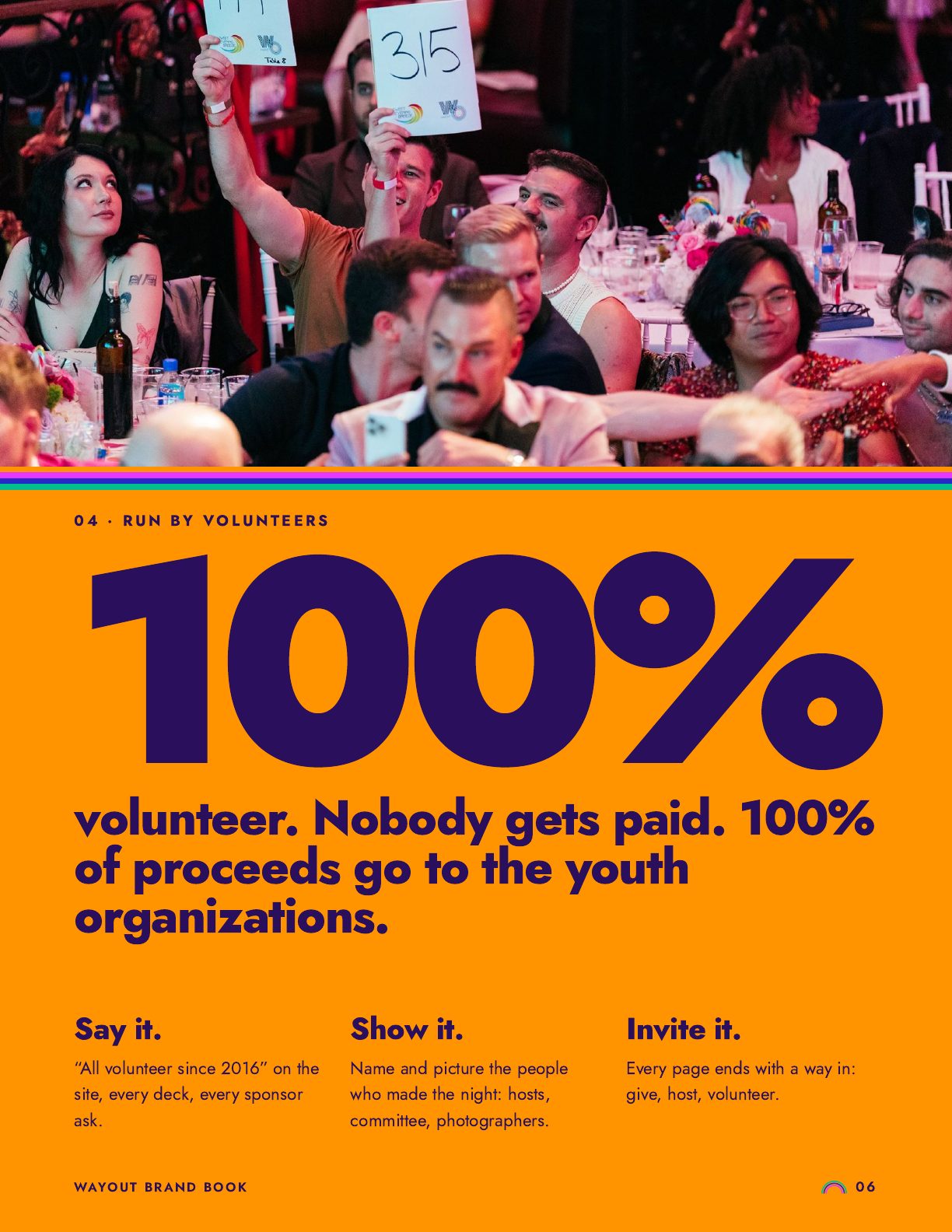
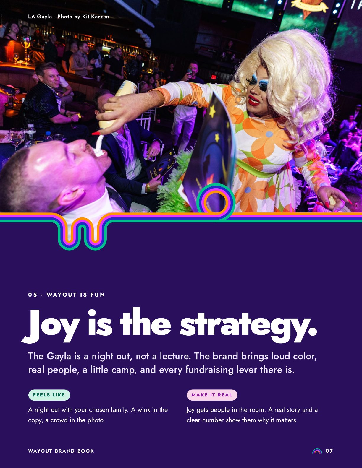
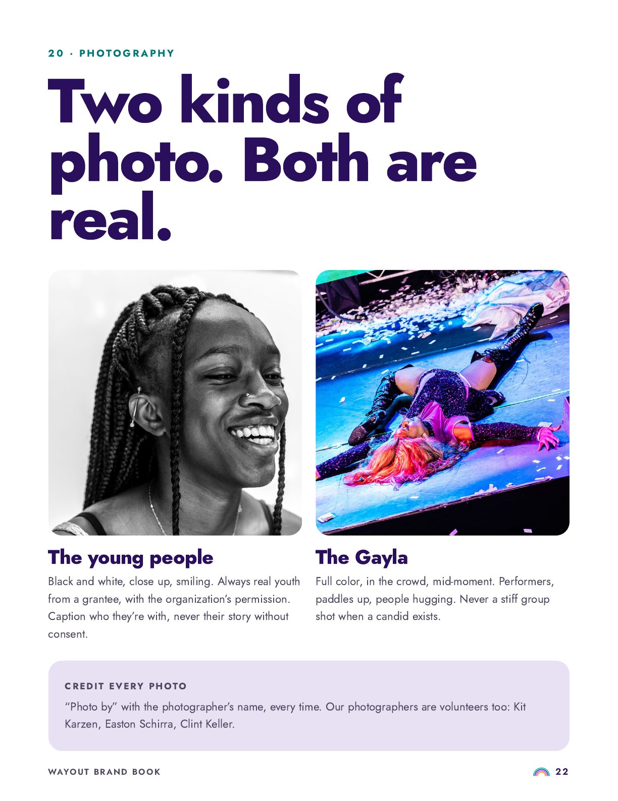
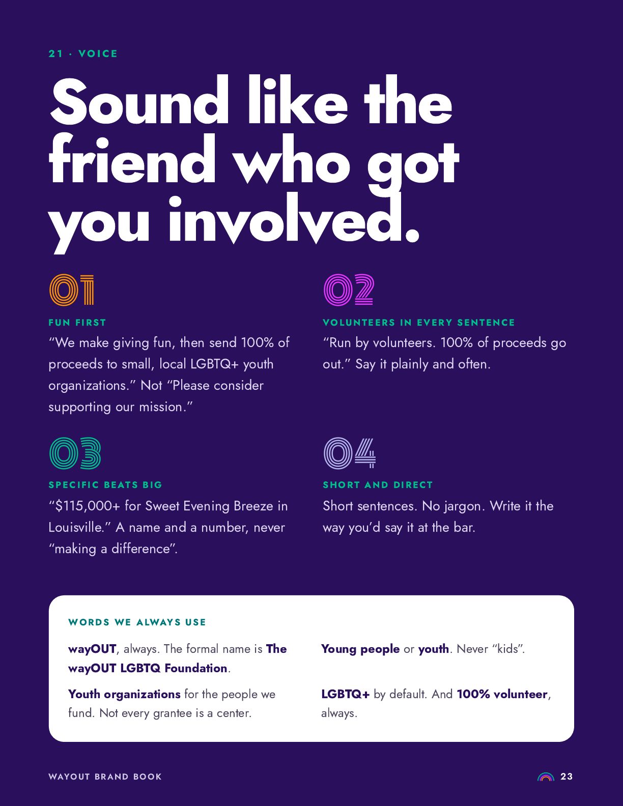
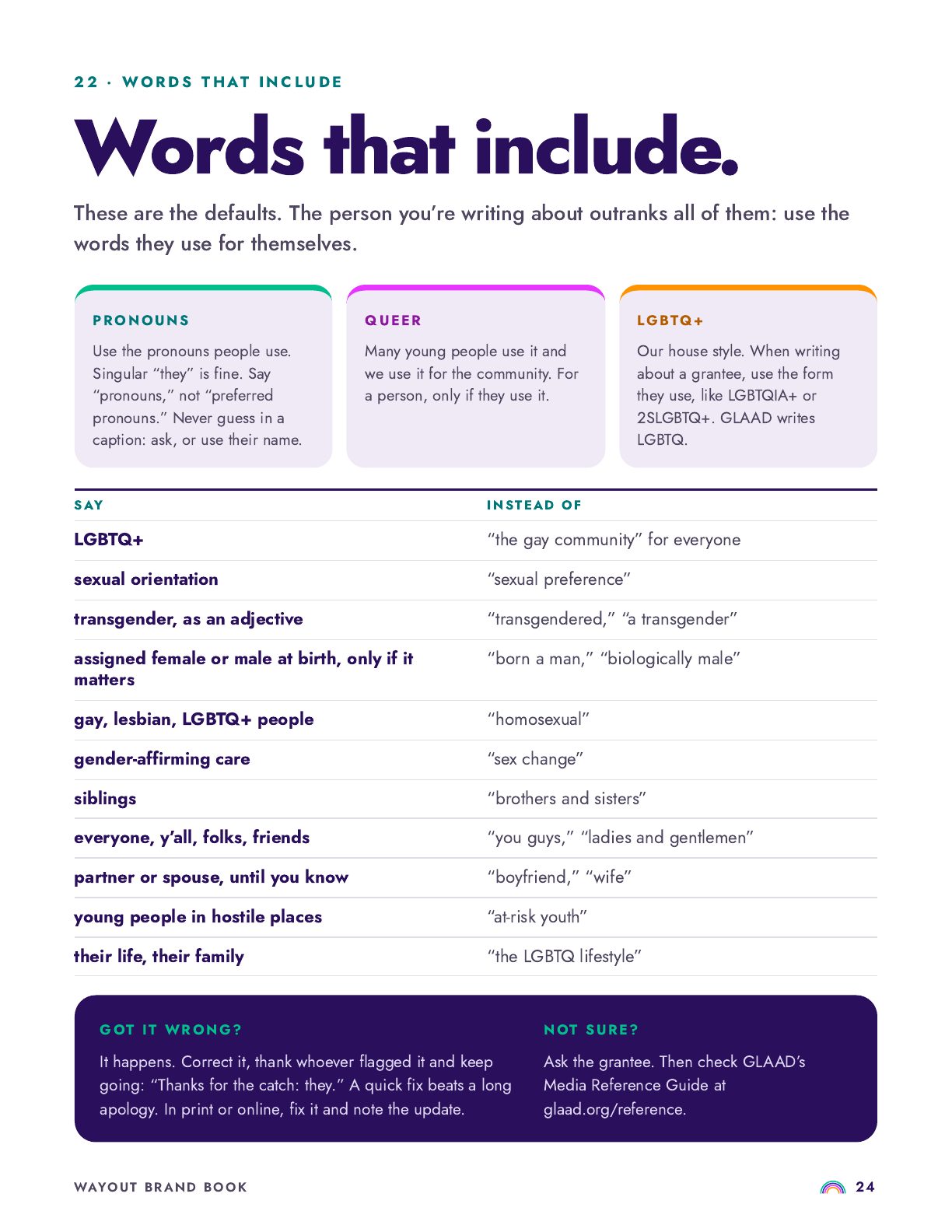
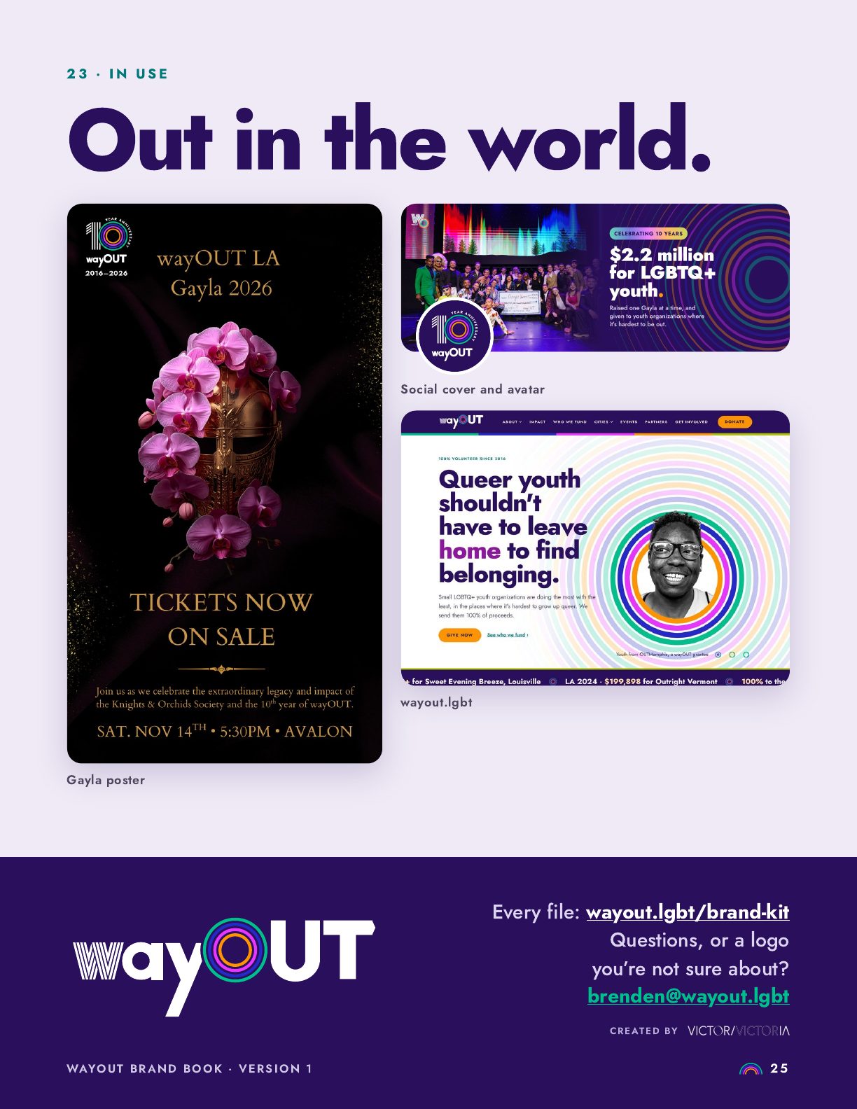
Values, logo, color, type, patterns, photography and voice, with do's and don'ts any volunteer can follow. Tap any page to read it.
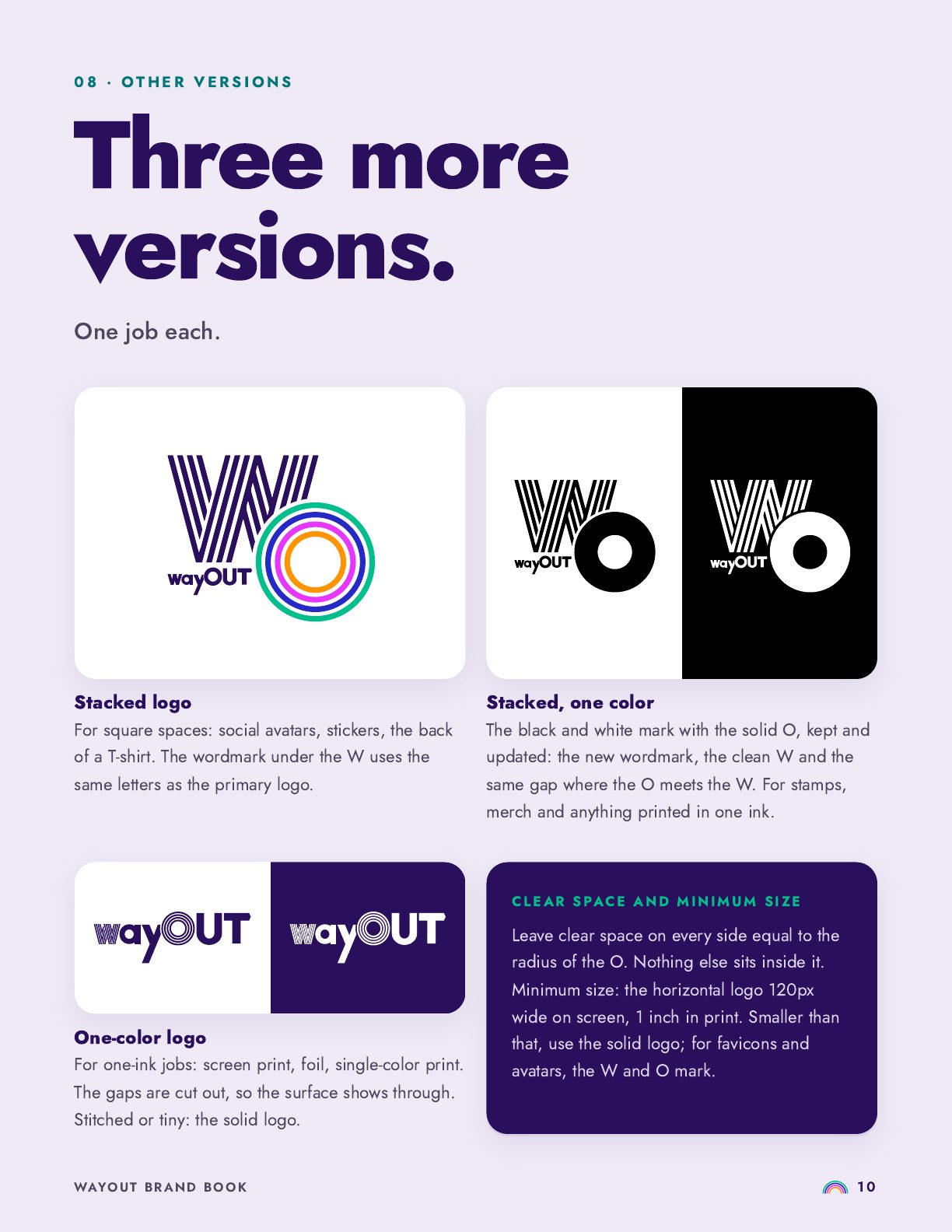
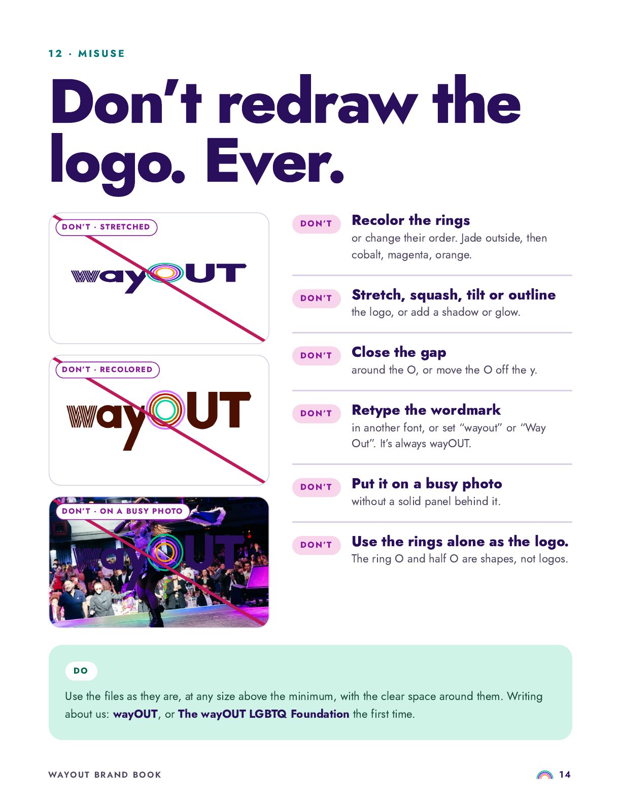
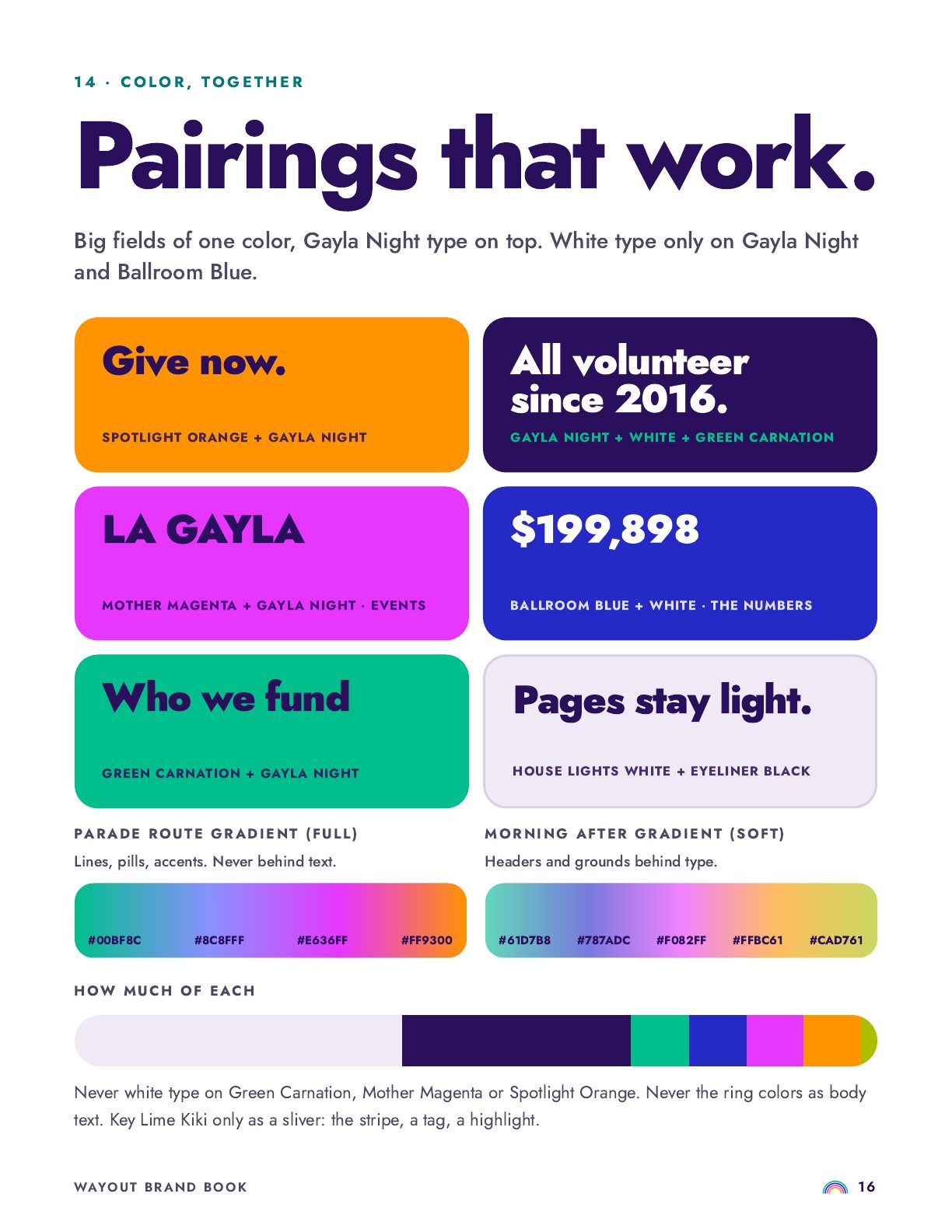
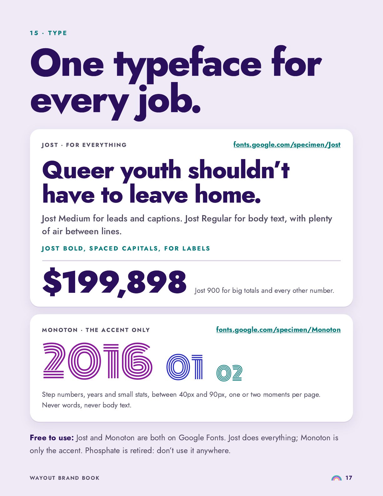
Part twoThe website
The impact page still said $750,000 raised. The real total had passed $2.2 million. The footer still read 2020. Victor/Victoria rebuilt wayout.lgbt to show what the foundation does, and where.
08Before and after
Drag between old and new, or switch to the top of each page, the full page, and real-size phones. The new site is live: scroll it, hover it, tap it.
09The work
One question shaped every page: what does a first-time donor need to believe before they give?
wayOUT backs the small, local programs where it's hardest to grow up queer. The site puts them first and the party second.
Mission, vision, the wayOUT Way and the WAYOUT values, rebuilt with the board. All 29 youth organizations get their own card.
The new brand on every page. Hand-built pages a volunteer can update, and redirects so no old link breaks.
10The details
Every feature answers a donor's question: where does the money go, how much, and to whom.
Keep scrolling: the logo opens up and the O zooms until you're standing in the room.
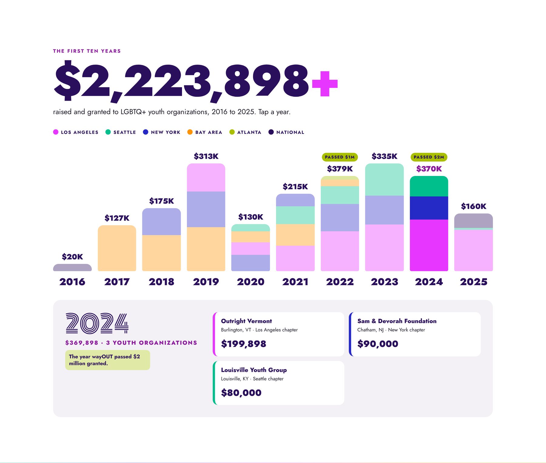
Every year, every chapter, every grant, adding up to $2,223,898.
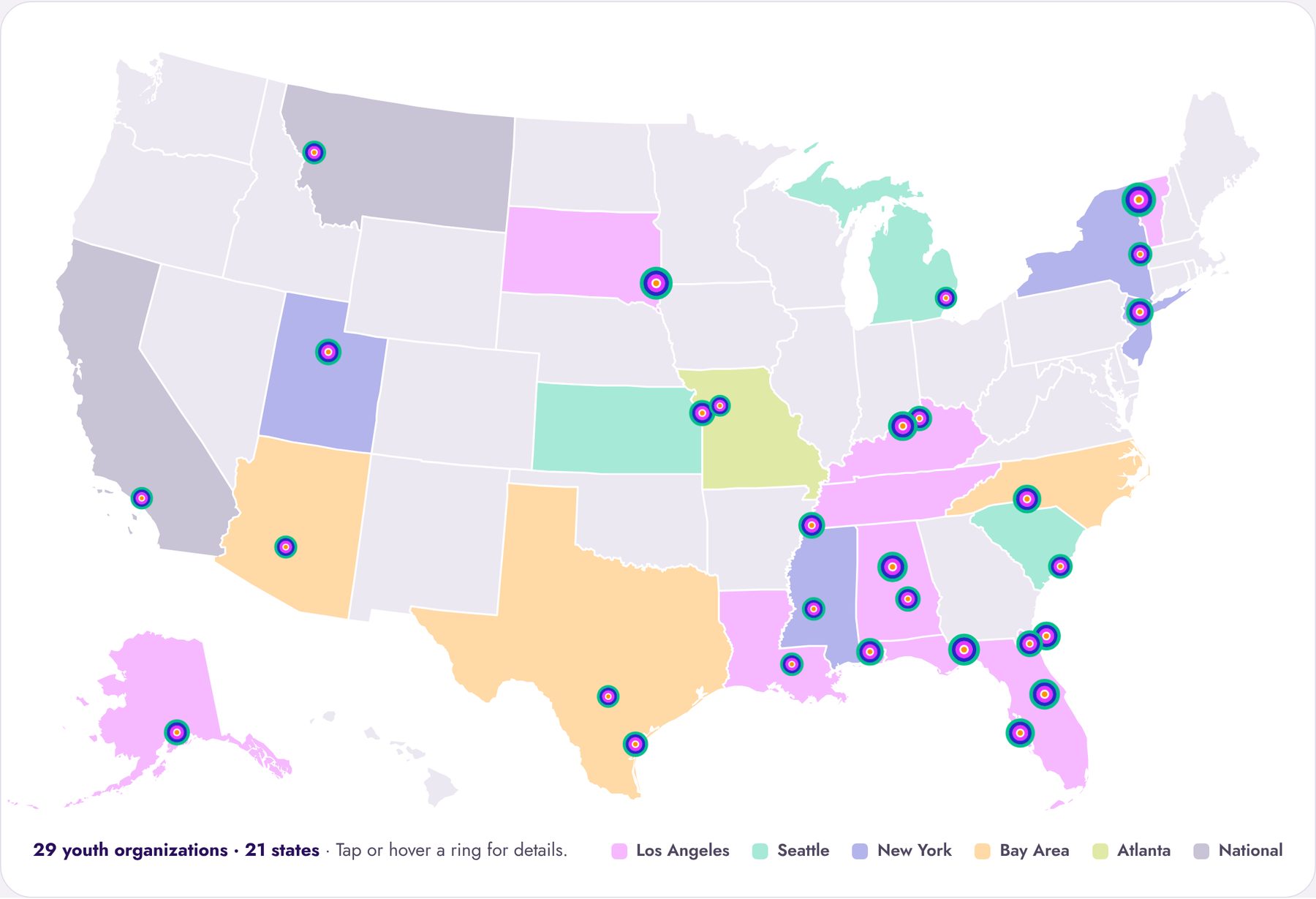
29 youth organizations in 21 states, on a map you can tap.
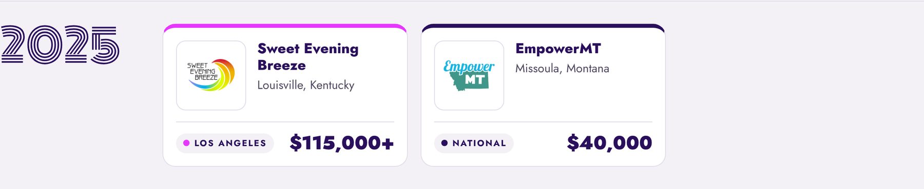
Logo, place, chapter and amount, each linked to the organization.
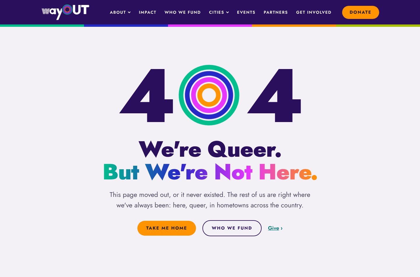
"We're Queer. But We're Not Here."
11Results
Files and weight measured on a phone, across the eight pages that exist on both sites.
85%
32 files per page, down from 220.
HALF
Pages average 1.6MB, down from 3.1MB.
10
Down from a 21-link menu that was confusing to navigate.
Old site measured live, October 2026, before launch. New site measured from its launch build.
12The result
One logo with its history built in, one palette, one book and one website, so a volunteer in any city can make something on a Tuesday night that looks like wayOUT on a Saturday at the Gayla.
Victor/Victoria
The wayOUT LGBTQ Foundation · wayout.lgbt
Kit Karzen and the wayOUT community

